
INDIA
2024
BUILT
NO NAMES
Dating, without the dating app ritual.
UI/UX
DEVELOPMENT
Cater 18-35 wealthy individuals
Base the swipes on plans

The IDEA
Design a dating product for people who are tired of behaving like they are on a dating app.
There was no useful reference to copy. The concept asked people to behave differently from Tinder-style swipe-and-chat products, while still understanding it instantly. The interface had to explain a new behaviour without turning into a tutorial.
01
Less judgement by photograph
Give the plan itself enough importance to start a connection
02
Less conversational perfromance
Remove the pressure of inventing the perfect opening line
03
Less waiting
Move the interaction toward an actual plan and an actual meeting
THE APP FLOW

Sign Up

Post a Plan

Receive Requests

Match

Chat in presets

Meet in real life
The HOMEPAGE
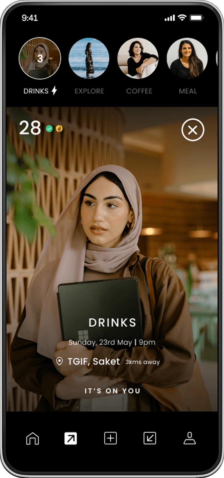
Two reasons people open a dating app. A double tap interaction made it intuitive.
Some people care about the plan. Some want to know the person first. The homepage does not force one behaviour onto both.
01
Plan Mode makes the outing the protagonist.
For users interested in going out based purely on the plan.
03
Profile Mode makes the person the protagonist.
For users who prefer to see who they're meeting.

Profile Mode

Plan Mode
The INTERACTION HISTORY
A quick glance at all your requests sent and received
Sent and received requests are represented as circles: a fast visual scan of everyone you have interacted with, rather than another list of messages to manage.
Requests Sent

Requests Received
Preset messaging
The chat was intentionally made worse.
Preset prompts reduce the performance of “what do I say?” while still giving both people enough information to decide whether to meet.

Chat Listing

Requests Received
NAVIGATION
New product. Familiar signals.
Because the behaviour was unfamiliar, the navigation could not be. The icon system borrows recognisable conventions and gives them product-specific meaning.

Empty State

Selected State
The design worked for the users. The app went live.
KANAV PURI
THE CLIENT

